
The most important function of a book’s cover is clear communication.
A beautiful cover might catch the eye, but a smart cover makes a promise. It tells readers exactly what kind of story they’re about to dive into.
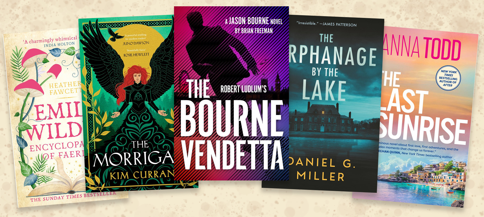
In todays crowded market place, the most important job of a book cover isn’t just to look good. The job of the book’s cover is to clearly convey the books genre and tone so the buyer feels confident they are purchasing the story they want to read.
Potential readers rely on visual cues when they’re browsing books online. Fonts, colours, imagery and layout all send important signals: Is this a spicy romance? A gritty thriller? A whimsical fantasy?
When the cover sends clear and intentional signals, the right readers are more likely to click, sample and buy you book. But when a cover feels off-genre—or worse, confusing in its design—it creates doubt and hesitation that can cost you a sale, even if the writing inside is brilliant.
A cover that doesn’t hint at the tone of the book risks drawing the wrong audience and disappointing the right one. The goal isn’t just to attract any attention, but to attract the right attention.
For indie authors especially, a cover that accurately reflects the book’s content is essential. You don’t have a massive marketing budget or shelf placement in stores to help your book stand out. What you do have is a few seconds to connect with a potential reader, and your cover is your first (and sometimes only) chance to do that.
In short, a well designed cover isn’t just art, it’s a strategy. It’s a visual promise to your reader of the story within. When your cover gets the genre right, it builds trust. And trust is what attracts customers and builds an audience for your books.